Layout of pages
Containers
A Container manages how the contents of an HTMLElement fills the
available width. The contents can be confined to a fixed width (with
margins), or the contents can be fluid and expand to fill the whole
width.
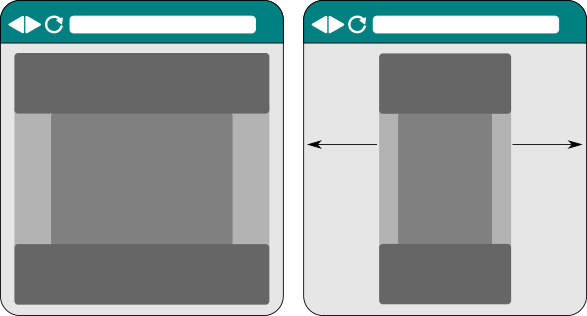
Fluid vs fixed containers on a site.
Different areas of a page may be laid out using different
Containers. For example, a header and footer area that both stretch
the entire viewport width, with a centered, fixed content area
inbetween.
Responsive layouts
A responsive layout arranges its contents differently, depending on the size of the device it is being displayed on.
For example, a Nav with many options displays on a cellphone as a
list of options stacked op top of one another. On a large screen, it
spreads the options in one row across the screen.
Use a ColumnLayout to control how your layout adapts to different
sizes of device.
A ColumnLayout adds a number of visual columns to a Div. Add
Widgets into each of the columns to control where they will
display. The width of each column is stated in 1/12ths of the total
width of the containing Div. If the total width of all the columns
is more than 12/12ths, the extra columns flow over to a new line.
A ResponsiveSize contains all the different sizes to use for a
column on different devices.
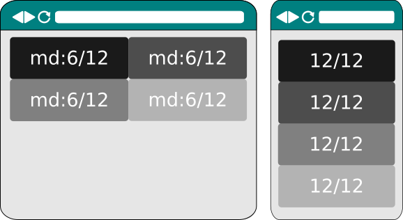
Columns with ResponsiveSize(lg=6) on a large device, defaulting to 12/12ths on a small device.
Add columns by giving a ColumnOptions instance for each column when
creating the ColumnLayout:
    def add_four(self):
        layout = ColumnLayout(ColumnOptions('first', ResponsiveSize(md=6)),
                              ColumnOptions('second', ResponsiveSize(md=6)),
                              ColumnOptions('third', ResponsiveSize(md=6)),
                              ColumnOptions('fourth', ResponsiveSize(md=6)))

        div = Div(self.view).use_layout(layout)
        self.body.add_child(div)

        message = '6/12ths on md and larger, else defaults to 12/12ths'
        div.layout.columns['first'].add_child(P(self.view, text=message))
        div.layout.columns['second'].add_child(P(self.view, text=message))
        div.layout.columns['third'].add_child(P(self.view, text=message))
        div.layout.columns['fourth'].add_child(P(self.view, text=message))
Columns can also be created after the ColumnLayout has been applied:
    def add_twelve(self):
        div = Div(self.view).use_layout(ColumnLayout())
        self.body.add_child(div)

        for i in range(1, 13):
            column = div.layout.add_column(str(i), size=ResponsiveSize(md=1))
            column.add_child(P(self.view, text='1/12th on md and larger'))
Note
ColumnLayouts need to be nested inside something with a Container layout.
Laying out a whole page
A PageLayout prepares a page so it has a header area at the
top, a footer at the bottom, and a content area in between.
Use a PageLayout in conjunction with with a suitable ColumnLayout
to further split the content area into different columns.
class PageLayoutPage(HTML5Page):
    def __init__(self, view):
        super().__init__(view)
        self.body.use_layout(Container())
        column_layout = ColumnLayout(ColumnOptions('left', ResponsiveSize(md=4)),
                                     ColumnOptions('right', ResponsiveSize(md=8)))
        self.use_layout(PageLayout(contents_layout=column_layout))

        self.layout.header.add_child(P(view, text='The header'))
        self.layout.footer.add_child(P(view, text='The footer'))

        left = column_layout.columns['left']
        left.add_child(P(view, text='To the left'))

        right = column_layout.columns['right']
        right.add_child(P(view, text='To the right'))